How effective is the
combination of your main product and ancillary texts?
Brand Identity
Throughout the music video and my two ancillary tasks i tried to keep everything similar to ensure there were links and that the audience would know who the product belonged to based on the similarities.
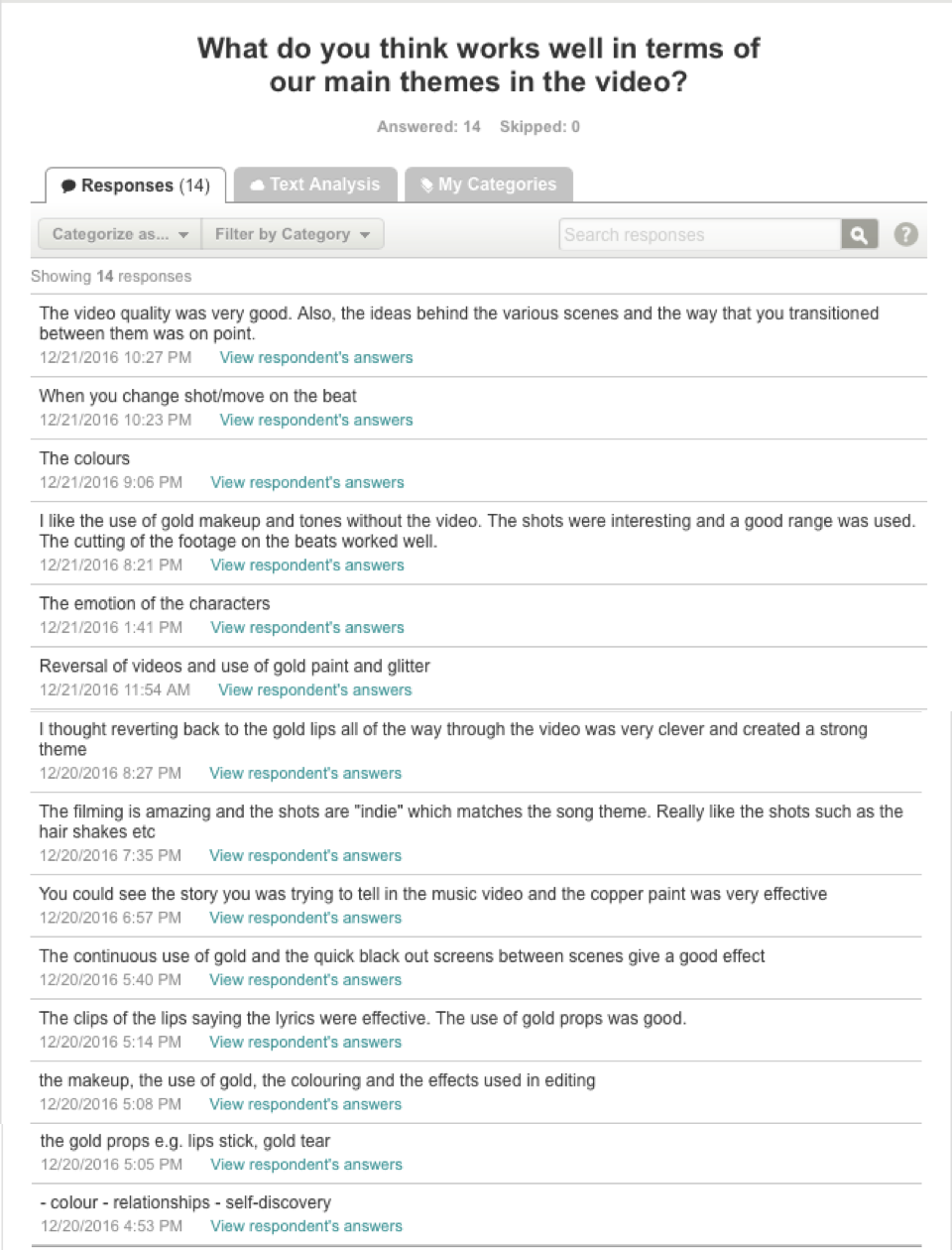
The main feature that was continued through the video, the digipak cover and the digipak advert was the colour scheme. The album and song is called Gold therefore gold was an obvious feature of all products. In the video the colour gold helped convey the narrative of the song, which was that the gold represents the values the girl had once she broke up with her boyfriend that she was unhappy with. Therefore the first girl featured in the video wasn't shown with gold at all, apart from in the argument scene when the gold was used to fight with representing it coming out of the skin as they broke up. The tear was also gold as we felt this help show that the gold has been within her the whole time and is coming out of her skin now she's single again. This then created a contrast when the second girl came into the video as her shots were full of gold. There was gold in the bed scenes which showed her as content with sleeping alone and not being with her boyfriend. We tried to make the shots on the field look warmer which kept with the gold theme and having her through balloons around continued the theme. In the studio a lot of gold confetti was thrown around to again show that all her values are back due to her being happy that the relationship has ended. Also in each shot the second girls makeup included a lot of gold glitter, gold stars and her highlighter was warm and these were shown in the many close up shots we filmed. The final way we showed the gold was by including an orange filter in the studio shots. In the digipak cover the images i chose were either close ups to show the gold makeup on the models face which i enhanced to make the gold stand out fully, or the images included a gold prop like the balloons and an image of gold glitter. The images i chose were also warm to continue the brand identity of having gold in each of the products.
via GIPHY
I kept the font the same on the digipak covers and the digipak advert, i chose this font as it was simple and clear and i felt it created an impact as it was clear to read and stood out. I chose to have the artist name in bold as this is the most important feature as without the artist name the audience wouldn't know who the product is created by. I feel the font fits the genre and the artist well however whilst receiving audience feedback i discovered that on the advert the writing would have worked better if it was a bit bigger and bolder so it stood out a bit more.
I chose to have the second girl that appears in the video rather than the singer on the digipak cover and advert as i feel she represents the brand identity of the artist as she is the 'happy version' of the singer. Having the singer on the cover and advert wouldn't have meant i could show the gold on them. If the singer were to release more albums she wouldn't be on the front of them either, the model creates the brand identity. This isn't a conventional feature of an album cover however is done by a few real artists, such as Sia who creates her brand identity by the same girl featuring in her videos and album covers and not having herself in either. The model and the gold that she has on her face will be recognisable so as soon as she's seen the audience will know who's music it is so this creates the identity of the artist.
The close up shots used throughout the video and also used in the digipak album cover is also a common recognisable theme. The reason we used the close ups on the model is to ensure we could enhance the gold used within her makeup. This is used in the video and the album to create a common theme between them both to again make the artist's work recognisable. The black background not only creates the brand identity but is also used to enhance the gold as black is quite a contrast to gold so it means the gold will stand out more than it would on a white background.
via GIPHY
Selling the product


Genre
Digipak:
The genre of my music video is electropop, therefor for the digipak and digipak advert i tried to include a lot of conventions of this genre to ensure the audience knew what genre it was just by looking at it and so it also connected with the video.
The images used on the front and the back are close up shots which enable the gold on the models face to be enhanced. Both by me enhancing the gold manually and also through the close up drawing the audiences attention to the gold straight away. Enhancing the gold in the editing stages it also a convention as most electropop album covers use some form of special effects and also bright colours therefore enhancing the gold is conventional of this.
Additionally, a convention of electropop is to be more focused on a certain concept of the music rather than the artist themselves, so i decided first of all to not have the artist on the front at all and also to have the model in a close up image which meant the focus would be more on the gold and therefore the music rather than the person on the front or the artist.
The image on the front of digipaks for electropop artists usually has some form of link to the music on the album, therefore i decided that each picture inside and outside of the digipak would have a gold feature, including the makeup worn by the model, the lighting, a filter and enhancing the gold in the props like the balloons and the glitter.
The colours used on the front and the back create a contrast as having gold on top of black makes the gold look more vibrant and eye catching, therefore in the inside of the album the tones are a lot warmer and vibrant again which is again a conventional feature, as is using a filter which i also used in the two inside images.
The images of the model on the front and back break the 4th wall. This is a conventional feature as electropop albums are very engaging and direct eye contacts makes the album cover engaging and would appeal to an audience.
Advert:
The image featured on the digipak advert is a wide established shot which means the location can be shown and also the outfit of the model. I added a filter onto the image which is conventional of an electropop advert, it also makes the image warmer which again is conventional. It also is quite an every day location which means it can relate to an audience. The outfit would also relate to an audience as a black dress is quite a mainstream outfit that would appeal to the audience of this genre of music.
The gold balloons is the main feature of the image as i enhanced the gold on the balloons and made them stand out a lot more than they did originally. This links to the concept of the music on the album, which again means the focus is on the music rather than the artist themselves. This is the case again by the fact that the model is facing away so the information on the advert can be consumed rather than the focus being all on the model.
Although the image is in on everyday location, the filters make the image unnatural and therefore quite quirky which is conventional of an electropop advert as it makes it more indie and appeal to an audience that is into indie music.
Strengths and Weaknesses


Brand Identity
Throughout the music video and my two ancillary tasks i tried to keep everything similar to ensure there were links and that the audience would know who the product belonged to based on the similarities.
The main feature that was continued through the video, the digipak cover and the digipak advert was the colour scheme. The album and song is called Gold therefore gold was an obvious feature of all products. In the video the colour gold helped convey the narrative of the song, which was that the gold represents the values the girl had once she broke up with her boyfriend that she was unhappy with. Therefore the first girl featured in the video wasn't shown with gold at all, apart from in the argument scene when the gold was used to fight with representing it coming out of the skin as they broke up. The tear was also gold as we felt this help show that the gold has been within her the whole time and is coming out of her skin now she's single again. This then created a contrast when the second girl came into the video as her shots were full of gold. There was gold in the bed scenes which showed her as content with sleeping alone and not being with her boyfriend. We tried to make the shots on the field look warmer which kept with the gold theme and having her through balloons around continued the theme. In the studio a lot of gold confetti was thrown around to again show that all her values are back due to her being happy that the relationship has ended. Also in each shot the second girls makeup included a lot of gold glitter, gold stars and her highlighter was warm and these were shown in the many close up shots we filmed. The final way we showed the gold was by including an orange filter in the studio shots. In the digipak cover the images i chose were either close ups to show the gold makeup on the models face which i enhanced to make the gold stand out fully, or the images included a gold prop like the balloons and an image of gold glitter. The images i chose were also warm to continue the brand identity of having gold in each of the products.
I kept the font the same on the digipak covers and the digipak advert, i chose this font as it was simple and clear and i felt it created an impact as it was clear to read and stood out. I chose to have the artist name in bold as this is the most important feature as without the artist name the audience wouldn't know who the product is created by. I feel the font fits the genre and the artist well however whilst receiving audience feedback i discovered that on the advert the writing would have worked better if it was a bit bigger and bolder so it stood out a bit more.
I chose to have the second girl that appears in the video rather than the singer on the digipak cover and advert as i feel she represents the brand identity of the artist as she is the 'happy version' of the singer. Having the singer on the cover and advert wouldn't have meant i could show the gold on them. If the singer were to release more albums she wouldn't be on the front of them either, the model creates the brand identity. This isn't a conventional feature of an album cover however is done by a few real artists, such as Sia who creates her brand identity by the same girl featuring in her videos and album covers and not having herself in either. The model and the gold that she has on her face will be recognisable so as soon as she's seen the audience will know who's music it is so this creates the identity of the artist.
The close up shots used throughout the video and also used in the digipak album cover is also a common recognisable theme. The reason we used the close ups on the model is to ensure we could enhance the gold used within her makeup. This is used in the video and the album to create a common theme between them both to again make the artist's work recognisable. The black background not only creates the brand identity but is also used to enhance the gold as black is quite a contrast to gold so it means the gold will stand out more than it would on a white background.
Selling the product


Genre
Digipak:
The genre of my music video is electropop, therefor for the digipak and digipak advert i tried to include a lot of conventions of this genre to ensure the audience knew what genre it was just by looking at it and so it also connected with the video.
The images used on the front and the back are close up shots which enable the gold on the models face to be enhanced. Both by me enhancing the gold manually and also through the close up drawing the audiences attention to the gold straight away. Enhancing the gold in the editing stages it also a convention as most electropop album covers use some form of special effects and also bright colours therefore enhancing the gold is conventional of this.
Additionally, a convention of electropop is to be more focused on a certain concept of the music rather than the artist themselves, so i decided first of all to not have the artist on the front at all and also to have the model in a close up image which meant the focus would be more on the gold and therefore the music rather than the person on the front or the artist.
The image on the front of digipaks for electropop artists usually has some form of link to the music on the album, therefore i decided that each picture inside and outside of the digipak would have a gold feature, including the makeup worn by the model, the lighting, a filter and enhancing the gold in the props like the balloons and the glitter.
The colours used on the front and the back create a contrast as having gold on top of black makes the gold look more vibrant and eye catching, therefore in the inside of the album the tones are a lot warmer and vibrant again which is again a conventional feature, as is using a filter which i also used in the two inside images.
The images of the model on the front and back break the 4th wall. This is a conventional feature as electropop albums are very engaging and direct eye contacts makes the album cover engaging and would appeal to an audience.
Advert:
The image featured on the digipak advert is a wide established shot which means the location can be shown and also the outfit of the model. I added a filter onto the image which is conventional of an electropop advert, it also makes the image warmer which again is conventional. It also is quite an every day location which means it can relate to an audience. The outfit would also relate to an audience as a black dress is quite a mainstream outfit that would appeal to the audience of this genre of music.
The gold balloons is the main feature of the image as i enhanced the gold on the balloons and made them stand out a lot more than they did originally. This links to the concept of the music on the album, which again means the focus is on the music rather than the artist themselves. This is the case again by the fact that the model is facing away so the information on the advert can be consumed rather than the focus being all on the model.
Although the image is in on everyday location, the filters make the image unnatural and therefore quite quirky which is conventional of an electropop advert as it makes it more indie and appeal to an audience that is into indie music.
Strengths and Weaknesses